The Challenge
Our friends at Bivalve Dairy provide quality, organic milk to well-known dairy brands (Clover, Cowgirl Creamery), and have future plans to produce their own line of organic dairy products. They approached designthis! with the challenge of creating a complete identity package and vision for their brand from scratch — a brand that communicates their quality and who they are.
Our Solution
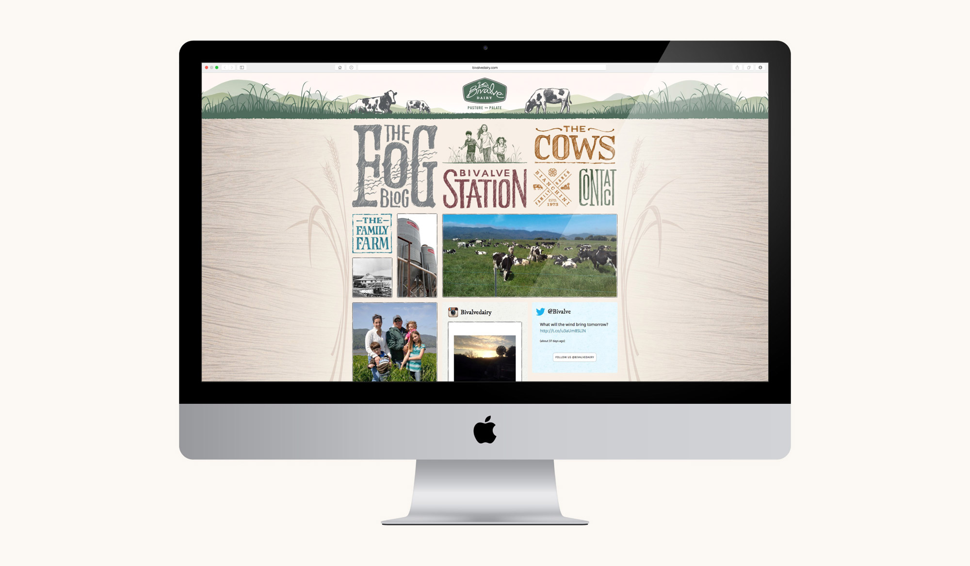
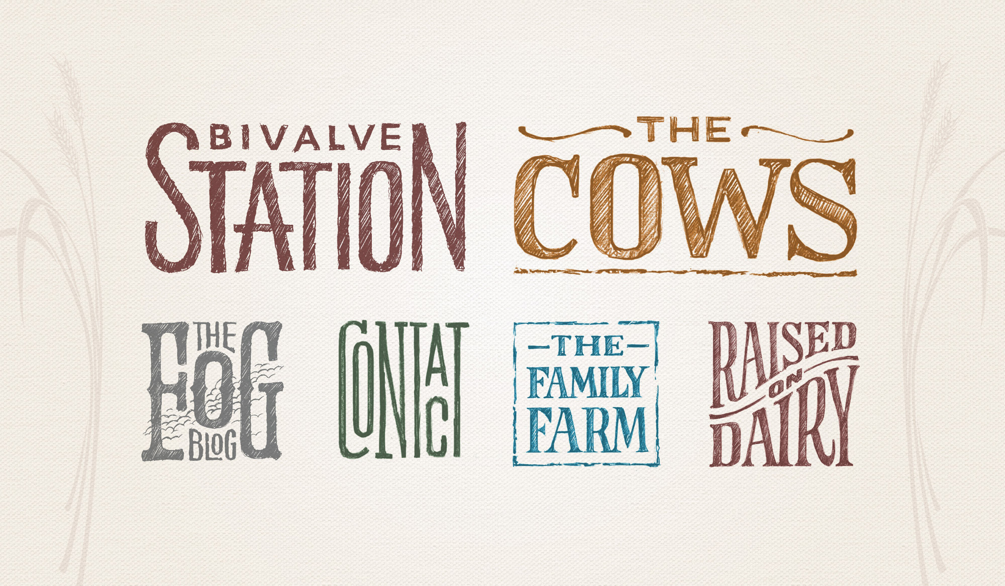
We knew Bivalve as a dairy company would require a multitude of collateral in different sizes and applications, especially in product packaging alone, so we created for them an ‘identity toolkit’ with various graphic elements and icons to use, to give their brand flexibility and consistency. Bivalve takes great pride in their quality, and we understood the importance of communicating their farming family heritage in their logo. We wanted their down-to-earth personality with a sense of natural ingredients to come across through a style of hand-drawn typography, illustrations and natural colors.
The Result
From the hand drawn elements to the natural colors and symbolic icons, the new identity and web presence we provided reflects their down-to-earth personality, their unique location and dedication to organic, sustainable farming. The brand also allows for room to grow when their own line of organic dairy products are produced.


“From developing logos, artwork, illustrations, packaging, website, business cards, social media sites, every expectation was met and more. We are thrilled with our brand and have had so many positive comments.”